How to build a giant brain!
11 Nov 21
The pandemic has well and truly thrown a huge spanner in the usual workings of everyday life. Across the entire planet, pretty much everyone is having to limit their expectations — whether it’s waiting three months for a doctor’s appointment, or not being able to buy a fresh lettuce.
Of course, limiting expectations doesn’t come naturally to us at Tilt. So, when a global brand asked us to make a high-end film around the topic of ‘mindset’, interviewing colleagues all around the world, the challenge was set.
So...no flying off anywhere, no face-to-face filming, and “...please, no more Zoom calls!” Okay ... how about a giant brain?
Finding compelling stories
The purpose of the film is to help demystify the company’s newly defined mindset behaviours for 80,000 colleagues in 40 countries. During our creative sessions, we recognised the need to make the topic of ‘shared mindset’ tangible and less nebulous — directly applicable to everyday life at work, avoiding ambiguity and corporate spiel. We agreed that hearing compelling stories from people who can directly relate the mindset behaviours to their actual jobs was essential.
Our first task was to seek out these stories and make a shortlist. Working closely with the client, we settled on three protagonists from varying roles around the world:
- A person-focussed colleague in the UK, who had decided to learn sign language at night school to help one of her deaf customers. She now teaches colleagues all across the UK.
- A financial colleague from the US, who is leading the way with environmentally focused enterprises.
- An Indian colleague, who invented a natural disaster resilience app that predicts the paths of cyclones, tracking them against colleague work-from-home location data across the subcontinent in order to maintain a robust business.
The visual treatment
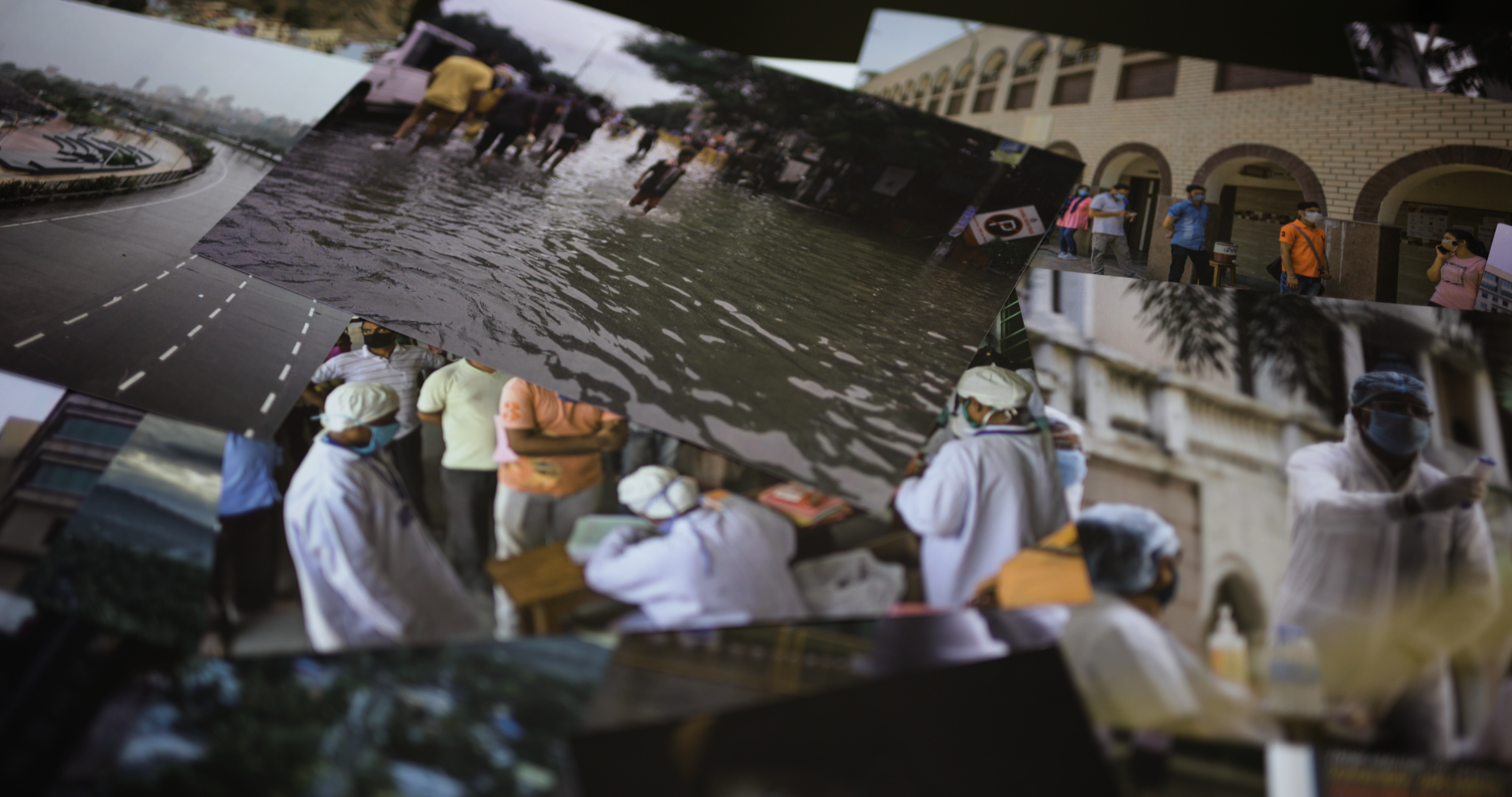
We weren’t able to physically film our storytellers, and the only real assets available other than stock imagery, were the interviewees’ smartphone photo libraries. So, we asked ourselves: If we were to shoot something metaphorical instead, what would a physical representation of the mindset behaviours look like? Might it be something bold, and visually powerful? Something to hold up for people to examine, draw comprehension from, and be inspired by — like a public work of art?
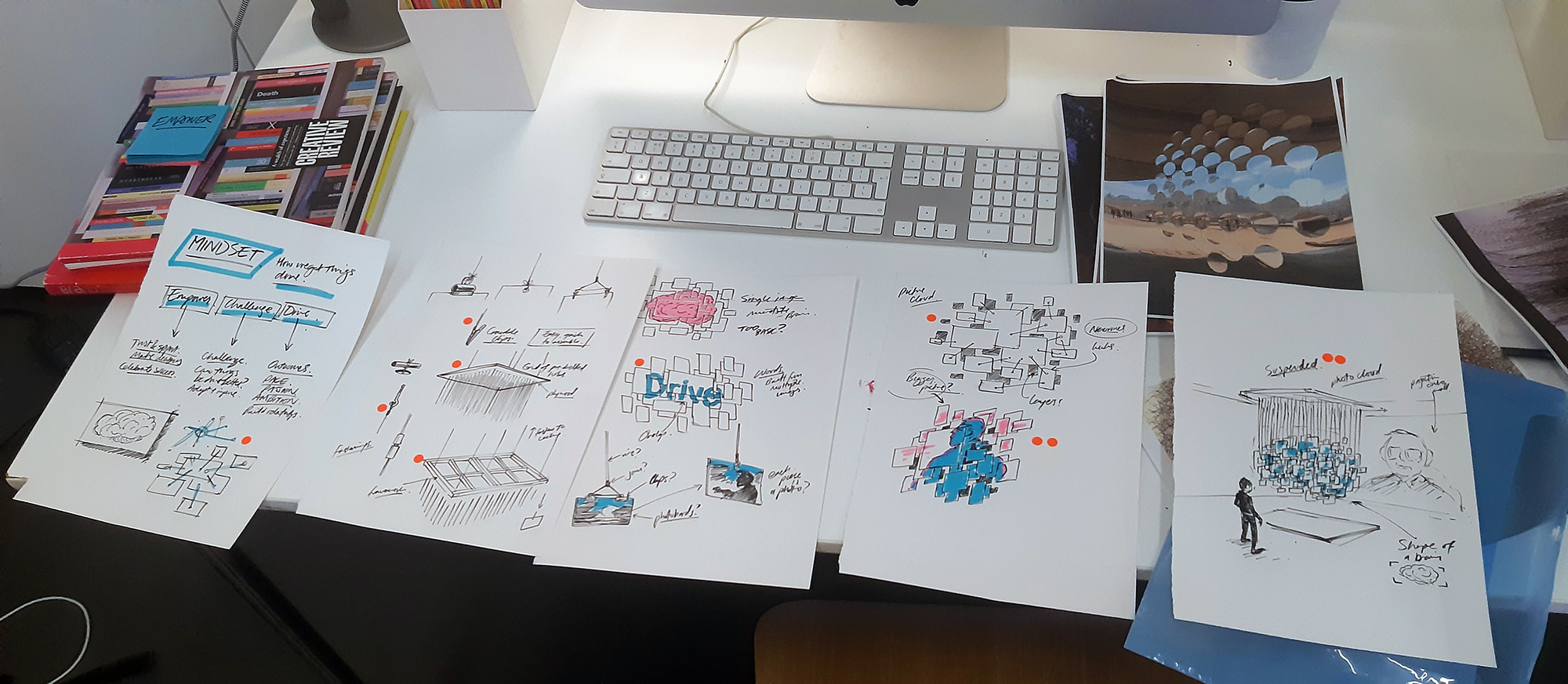
The idea was forming to create an art installation. Essentially a huge ‘cloud’ made from 400 of the colleagues’ photographs that forms the shape of a brain to embody the concept of a shared mindset — each picture and story being a part of the bigger organisational story and bringing tangibility to what had seemed nebulous. Perhaps, I thought, my Fine Art degree might finally come in use!
3D visualisation
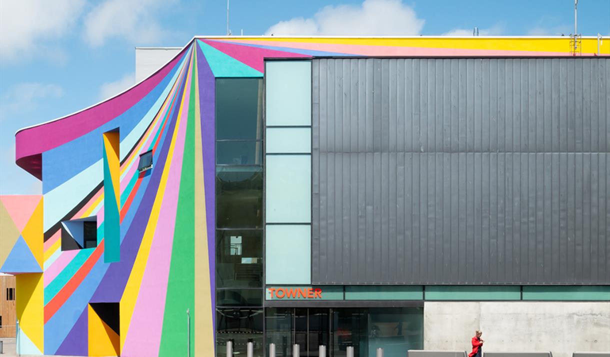
In Eastbourne, the hometown of Tilt filmmaker brothers, Harry and Fred Osborne, is the amazing Towner Art Gallery. Behind the colourful exterior, you find cavernous white spaces, with five-metre high exposed concrete ceilings and brutalist pillars. This would be the perfect location for our large-scale installation. We couldn’t take over the gallery for a month and design the brain in situ, so creating a visualisation was an essential step. It allowed for lots of experimentation and offered the client a very clear steer on what to expect and the opportunity for input and feedback in advance of the actual build.
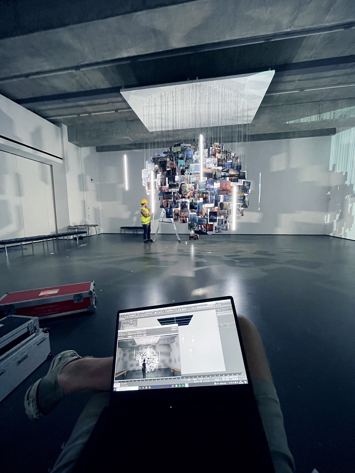
We captured the dimensions and textures of the gallery space, and rebuilt it in Autodesk 3ds Max — a powerful 3d animation tool that I’d got to know well during my time as an architectural visualiser in Melbourne. For the installation, we started with a stock low-polygon 3d brain model downloaded from Turbosquid, importing it to Autodesk 3ds Max. We made it symmetrical for ease of real-world build, and placed an extruded rectangle (the photographs) at every vertex of the model. From each of the 400 vertices, we ran 3d splines (the photograph support wires) up to a huge rectangular panel — ultimately to be fabricated from timber framing and hardboard and hung from the ceiling. Everything was to be assembled with the help of A0 blueprints, exported orthographically from the 3d software, so we would have an exact match to the pre-vis.
A trial run
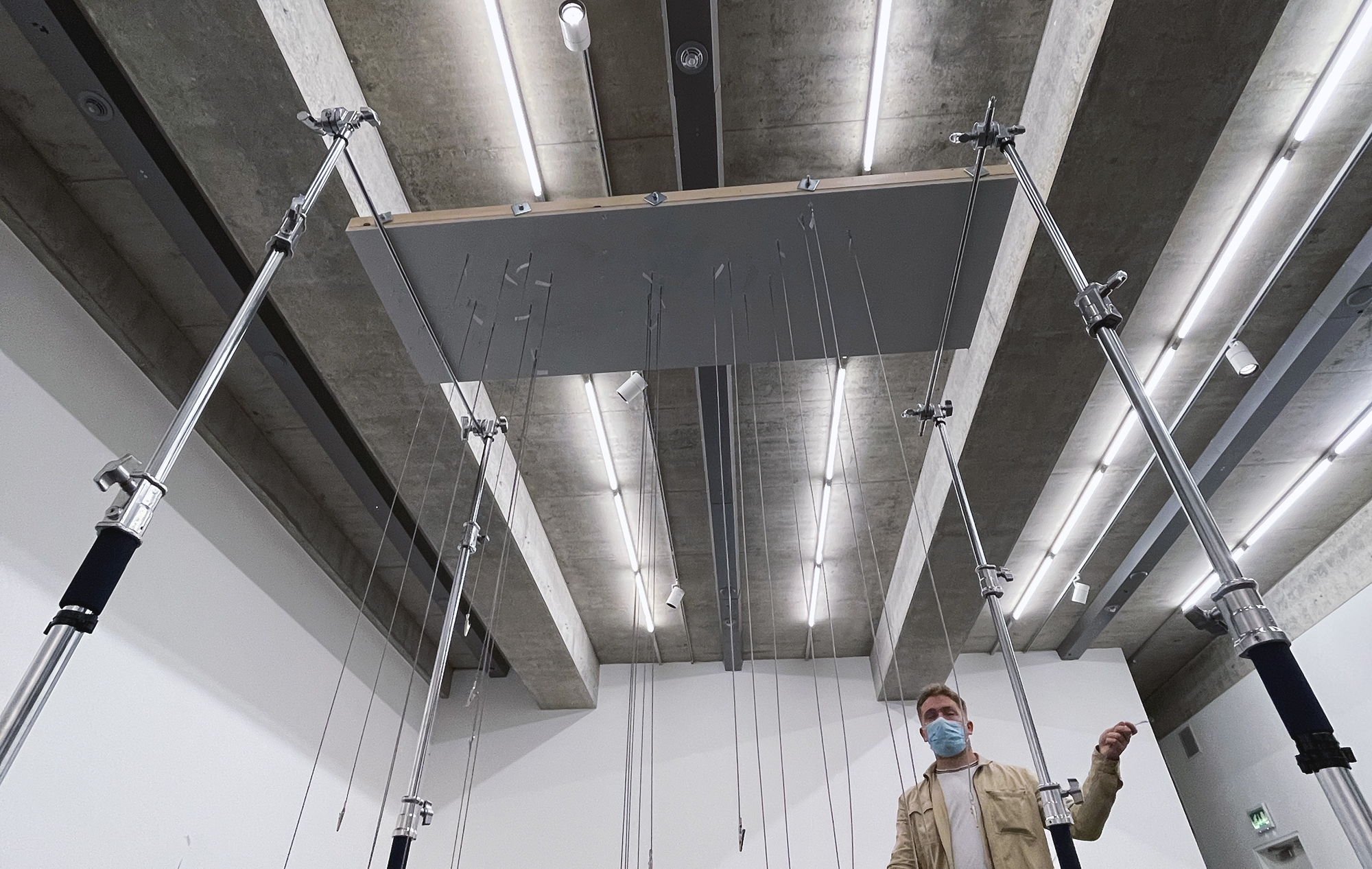
The ceiling panel from which all the wires are hung was fabricated in eight interlocking sections for ease of build and transportion. Taking an agile approach, we initially created two of these, bringing them along to the Towner Gallery at the technical recce, and testing them out on C-stands, extended to full height. This helped us to understand the physics of hanging, for safe assembly and to ensure the heavy panels would remain in place high above people’s heads. It also helped us to decide on the type of hanging material to use for the photos. It was immediately evident that fishing line, although transparent and strong, was very prone to tangles. A potential nightmare. We opted for thin, coated catenary wire, which resists extreme bending, hangs straight under its own weight, and reflects the light well for good aesthetics.
The build
We’d scheduled a day for build and a day to film, with a day’s gap in the middle should we run into any major issues, which was a fortuitous decision being that the construction took a great deal longer than expected, specifically in the assembly and safe hanging of the four times three-metre, 140kg ceiling panel.
On arrival at the gallery, there was a collective anxiety. As we stepped out of the production car in the early morning sun, Harry’s words best summed up how we were feeling: ”What if it just looks like a giant wet nappy?”
All the pieces of the clearly labelled puzzle were made in advance:
- 400 numbered photographs printed full-bleed on A4 450gsm card.
- 400 measured lengths of neatly coiled catenary wire complete with crimped hanging loops at the top and numbered crocodile clips at the bottom to attach photos.
- Eight timber and hardboard hanging panel sections, painted white and drilled with 400 numbered attachment points for the hanging wires.
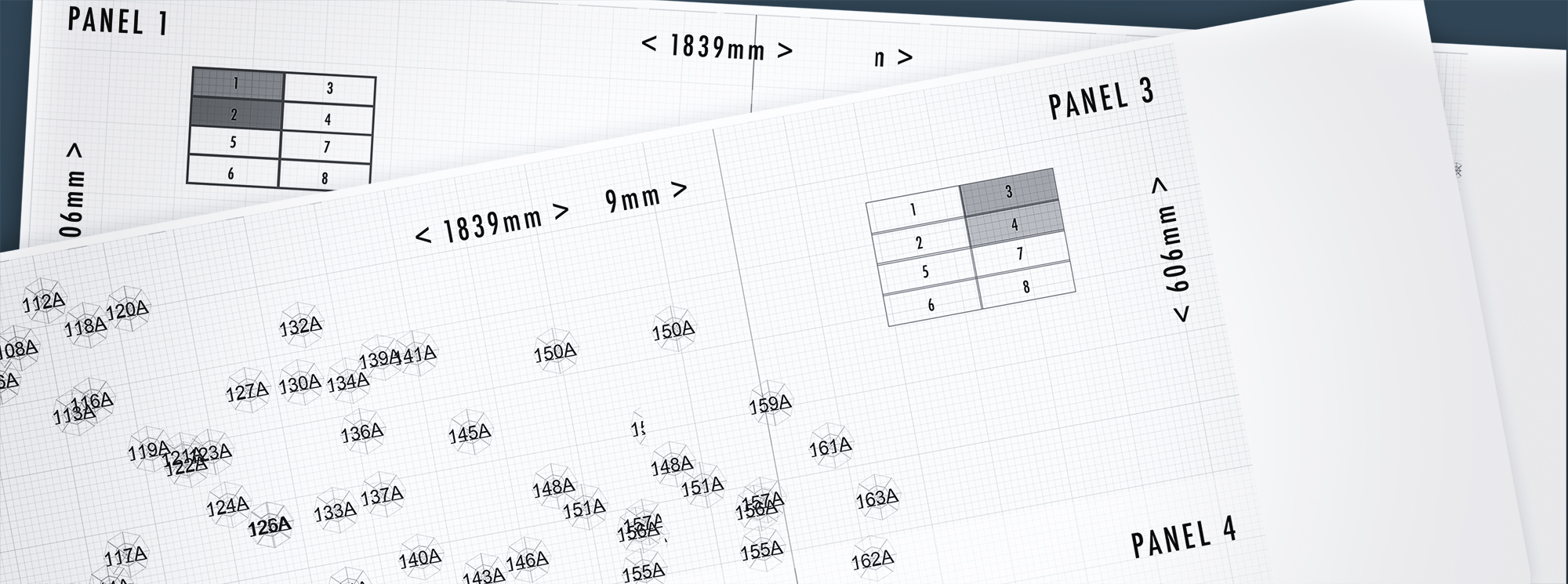
Each of the eight panel sections were raised to four and a half metres on a cherry picker. Gallery technicians, working from a separate scissor lift, bolted the eight panels together and suspended them from the ceiling with self-expanding bolts drilled into the concrete.
Once the panels were up and carefully levelled on their thick steel wire ropes, the process of hanging began using the scissor lift and step ladders. Working out from the centre in a planned, numbered order, we attached each wire in turn to its associated hanging point and photographs, taking care for everything to remain tangle-free.
Lastly, we made fine adjustments to each crocodile clip to ensure the photos were all aligned correctly to the curves of our four-metre high brain.
Lighting design
The pre-vis played a vital role in designing a powerful lighting scheme to really bring our installation to life. It provided technically accurate colour, fall-off, and diffuse shadow calculations, long before we stepped into the building and put up light fixtures.
We were inspired by works like Cold Dark Matter: An Exploded View by artist Cornelia Parker, where a lone lightbulb is used at the centre of a blown-up garden shed — freeze-framed in the air at the point of explosion — to cast dramatic shadows on the surrounding gallery walls. Similarly, we hung a single, high-powered LED omni at the centre of our creation, powered from electrical points on the ceiling above. The light fixture was connected to a pulley system that allowed us to move the central light up and down remotely off-camera. This provided dramatic movement of the photographs’ shadows projected all around the gallery space.
We experimented in pre-vis using the light-sabre like Astera Titan LED tubes, integrated into the installation as a form of practical lighting. These would light up the photos so they are not silhouetted by the central omni, and offset the effect of the omni’s shadows on the walls so they don’t feel too film noir.
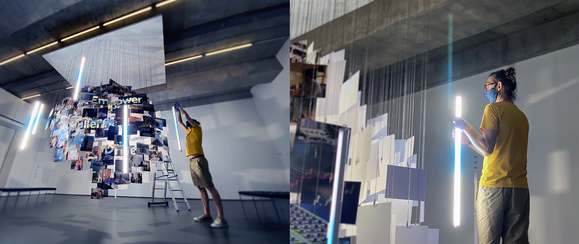
Hired from our ever helpful friends at Pro Motion Hire, the Titan tubes offer a futuristic aesthetic that you might find in a tech advert or music video. They are brilliant in their ability to be animated from your smartphone, which Harry programmed using exact brand colours. They’re immensely versatile, and in other parts of the filming, they doubled as soft Kino Flo-type fixtures when bolted together, or stuck with gaffer tape behind the concrete pillars to add drama.
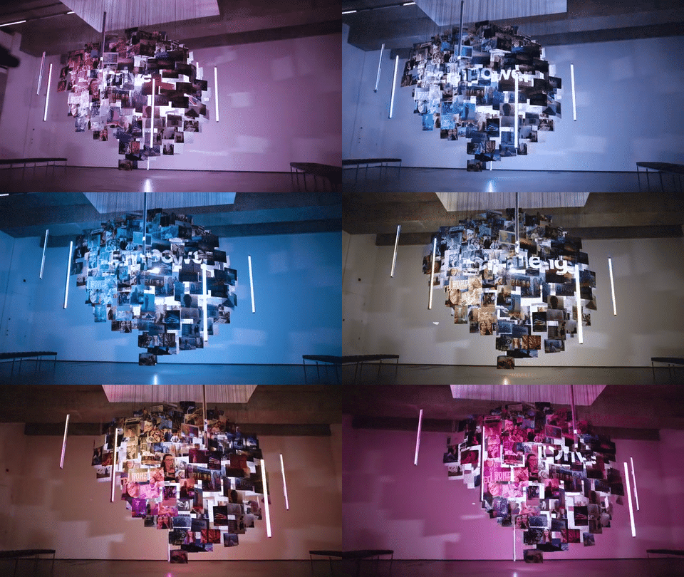
The final aspect of the lighting scheme was to project large typography onto the photos that make up the brain, to keep the mindset behaviours front and centre — animated by Roberto from our motion team in the brand font and style. Although we had pre-vis as a tool, it was hard to know exactly how this would look in advance with all the slight rotations that occur in hanging photos. We kept the projector mobile on a cherry picker so that we could experiment with placement on the day, and also did some rapid on-site adjustments in After Effects to perfect these alignments.
All-in-all, the finished installation really took our breath away. We were so relieved that it looked nothing like a giant nappy, and comparing it in situ with the visualisation, it looked even better than we could have hoped.
Telling the stories
You may be thinking that it’s all well and good to make a giant brain out of hanging photographs, but what about the stories themselves? Well when we said, “No video call interviews!”, we weren’t quite telling the truth. In advance of filming, we interviewed our three protagonists via video calls to really get to the heart of their stories. We then formulated three scripts using their own interview words, and used the Teleprompter app for the three colleagues to record themselves delivering the scripts under our remote direction. This would bring the required succinctness that is hard to achieve in an edited interview, while keeping the message authentic.
This is where we decided to do something that would blow this video call format out of the water. With the quality that we were trying to achieve in the film, cutting in screen recordings was really not an option. Instead, we projected the self-recordings five metres tall and eight metres wide in the gallery space —filling an entire wall of the vast room.
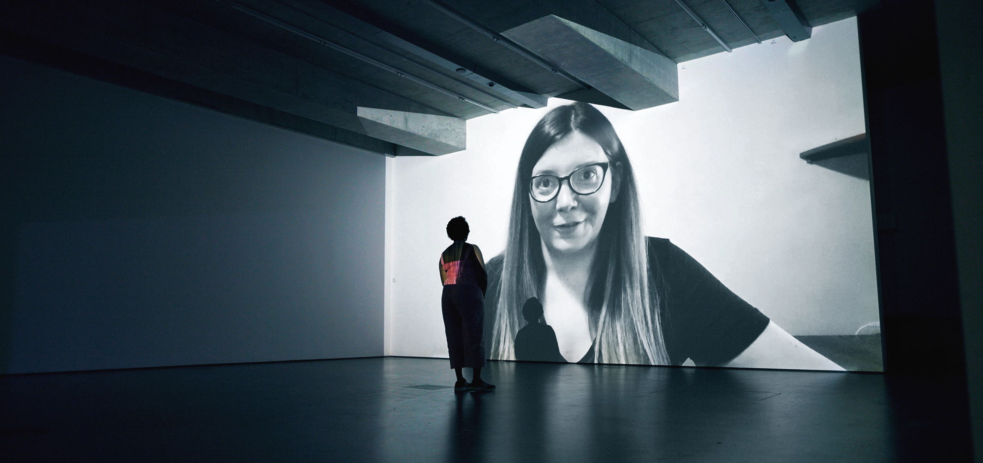
It required a high-powered projector at a 10-metre distance, for which the dimensions of the room thankfully allowed. We went in at a severe angle, and warped the footage back into its correct shape, so that the projections would throw a subtly evolving light on the installation, but not cast massive shadows of it all over the projected footage. Not only did these oversized projections look fantastic, but they placed the colleagues firmly in the same space as the installation, despite being filmed around the world.
A key element was seeing an artist, played by an actor, as she creates the installation — making sketches, designing the brain in 3d, using Photoshop to grade the images, printing them out on heavy A0 card from an industrial printer (courtesy of Brighton’s Exhibit Printing), trimming photos with a steel ruler and scalpel, hanging the finished photos on the wires etc. In this way, the narrative is brought to life through B-roll that is primarily focused on the images themselves, carefully chosen to illustrate the dialogue at the right moments, as we hear the colleagues tell their stories. We never really ‘meet’ the artist, but she is there simply to guide us through the narratives with the curated images.
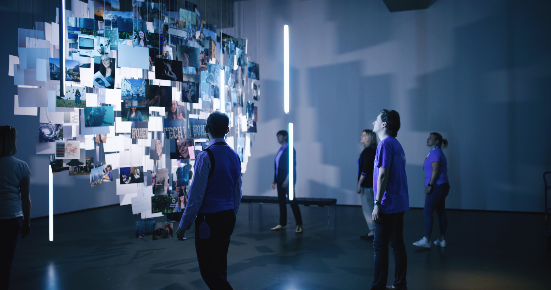
At the end of the film, there is the big reveal as we understand that what we’re seeing is a giant brain made up of photographs, as it is lit up in its full glory. We invited a group of the company’s colleagues to come into the exhibition space, to look at the installation and be inspired to think about their own mindset at work. This scene concludes the film, relating everything back to the workplace.
Camera movement
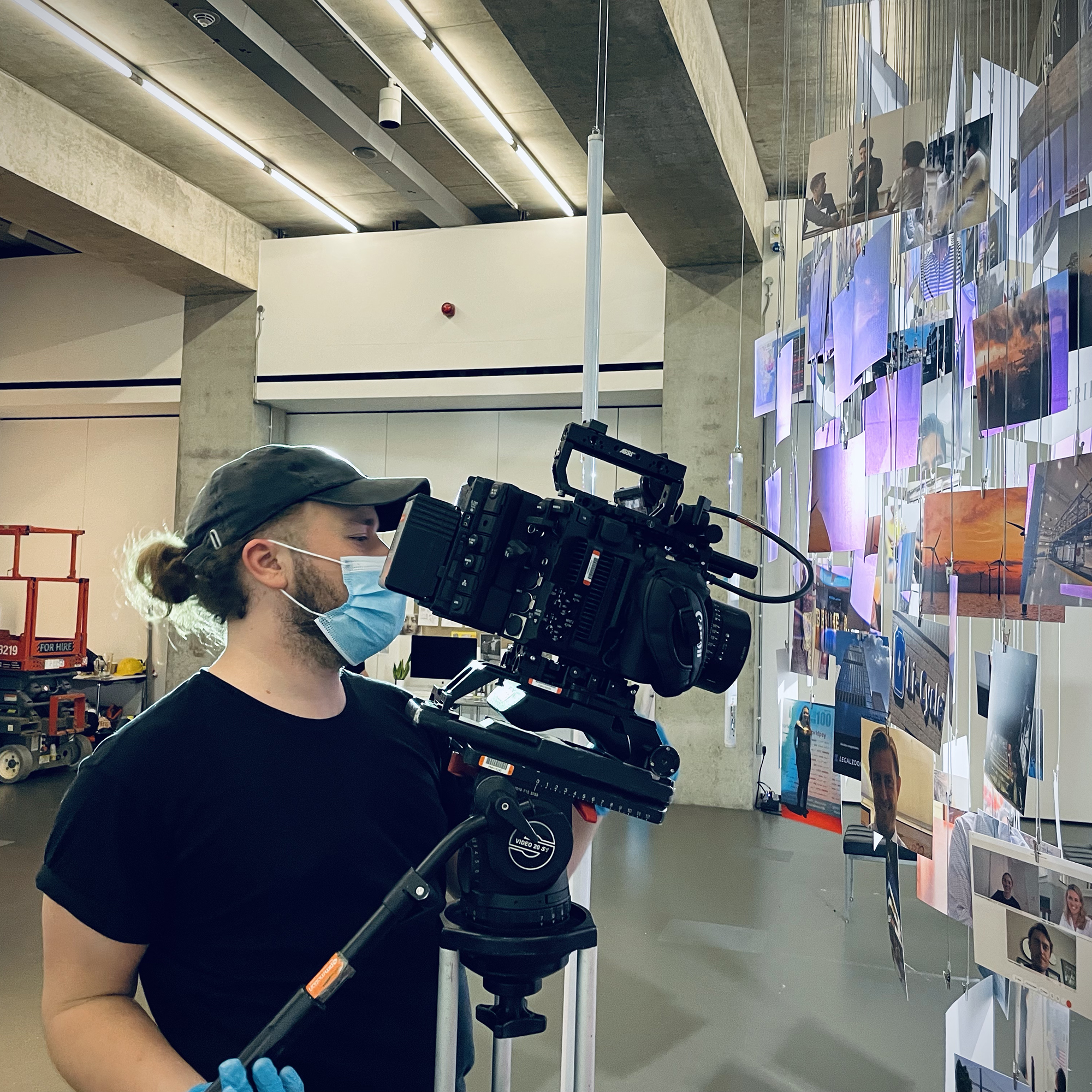
The best way to understand the brain in a visual sense was to move around it. The pre-vis offered the ability to plan camera movements and make an animatic from low-res vis renders, which not only helped the client to achieve stakeholder sign-off, but allowed us to shoot to order from a comprehensive shot list, cutting out many unknowns on the day. It also helped our cinematographer, Harry, to decide on the kit bag. We were seeking a weightless, free, and easy motion around the installation, and with no need to capture location sound, we were at least open to seeing if this could be done safely with a drone. Even with a small prosumer SUA, like a DJI Mavik 2. However, one crash into the installation would have been a complete disaster, so it was ruled out very quickly.

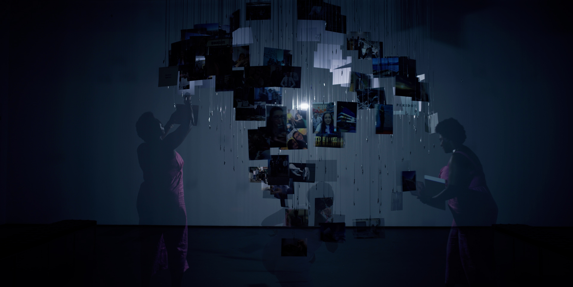
Instead, Harry opted for the FloatCam Dolly Crane HD — an all-in-one heavy duty slider, jib, and vertical tower. When mounted on an Egripment Universal Dolly, this versatile set-up provided the unrestricted camera movement that we desired … with a little bit of sweat, a few multiple takes, and some help from Warp Stabiliser in Premiere Pro. We added a FloatCam Motion Control System to produce a series of overlaid ‘ghosted’ shots of the artist at work, which required multiple takes that used the exact same camera movement.
Achieving the right look
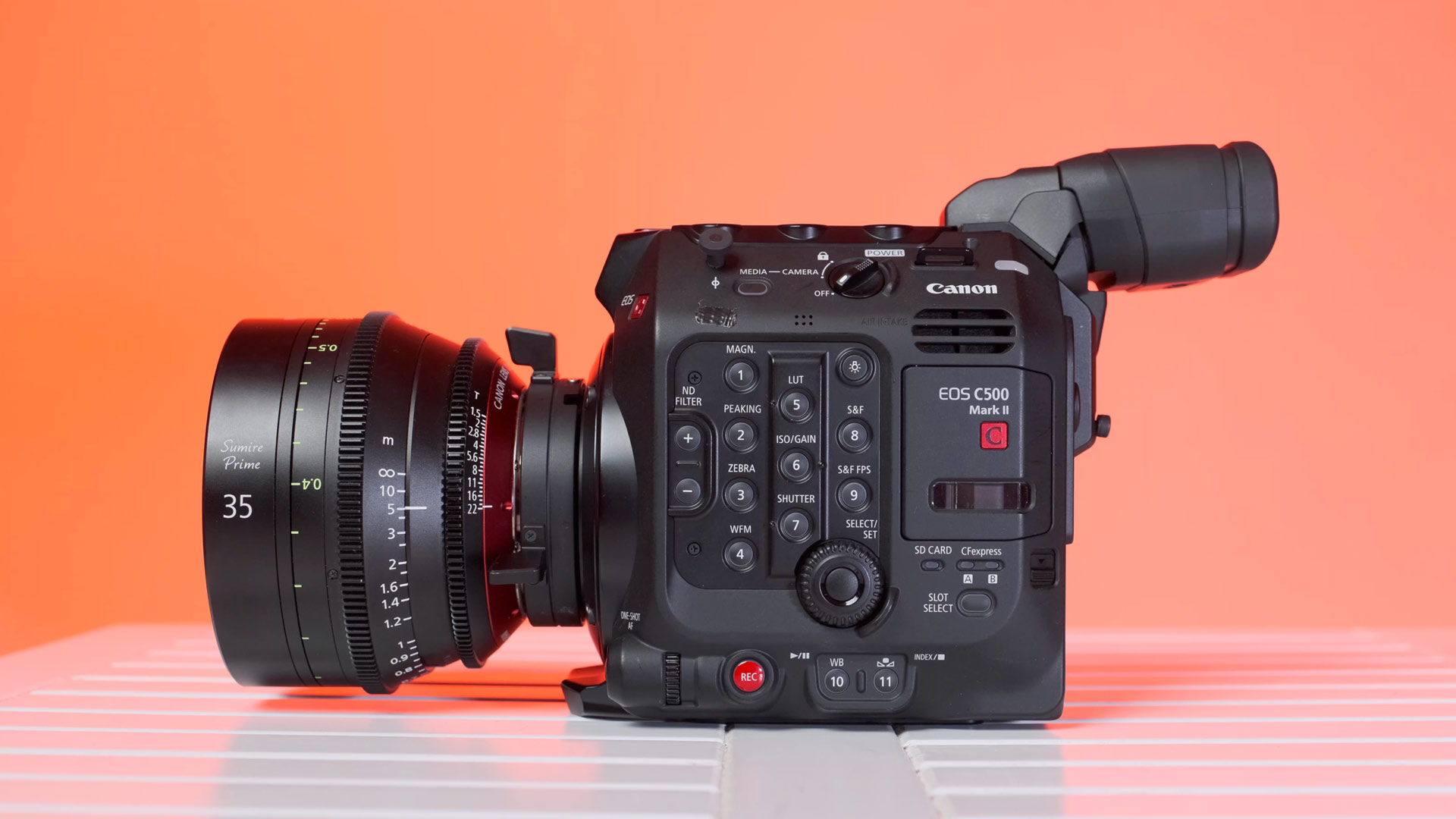
Everything was shot in 5.9K on the Canon C500MkII cinema camera, with its full-frame sensor, beautiful colour science and relatively high specifications. There’s lots of excitement at the moment around full-frame sensors, but in reality for a lot of projects, a Super 35mm sensor will usually do just fine. In this case, however, there was a solid justification. The pre-vis had taught us that super wide angle shots worked best in showing off the sheer scale of brain — particularly when seen in relation to human beings. Anything that took away from that wide angle (i.e. the crop factor of a smaller sensor) would be detrimental to the film.
We matched the C500 with a PL mount Sigma Cine Prime lens set, which offers quality glass at a price that isn’t going to blow the budget.
Sustainability
We filmed the process of the artist ‘building’ the installation in reverse. This meant that once the hero shots of the big reveal were in the can, it was time to start the staggered disassembly process. Having spent many long days designing and building this installation, it felt heartbreaking for all of us, but this is the nature of film making.
So, what do you do with 400 lengths of catenary wire, 400 photos, and a giant wooden panel if you can’t stomach sending it all to the skip? Well, our creative producer, Sophie Robehmed, got chatting with the lovely Towner Gallery staff, and it so happens that the wires are now going to be integrated into a creation by installation artist, Yayoi Lidbetter. Some of the timber is about to become sound-dampening panels in my home music studio, while the rest went to a wood recycling centre in Eastbourne. As for the A4 card photos, let’s just say there are some creatively inspired Tilt children using them as canvasses for their latest crayon masterpieces!

Lessons learned
Most of our projects at Tilt tend to be within the digital domain. One thing that’s easy to underestimate when creating something analogue, is that it will always take longer than you think. Another big takeaway is forward-planning. It hadn’t really occurred to us to include a visualisation at the proposal stage, but this saved so much time in the design process, ensured the client was kept in the loop with the aesthetics, and took away much of the anxiety around whether or not it would actually work.
In retrospect, it would have been better to hire a range of specific filming equipment, rather than trying to do everything with with the Floatcam Dolly Crane. However, time was not on our side, and this would have definitely required an extra day of filming. I had high hopes for some top-down sliding shots, and this simply wasn’t possible to do safely with our set-up.
Above all, however, I would say that when it comes to creativity in these challenging times for filmmakers and creatives, we’ve confirmed our belief that you can still think big and surpass client expectations, rather than having to try and limit them. And if we didn’t think that way, I guess we simply wouldn’t be Tilt.
SHARE: